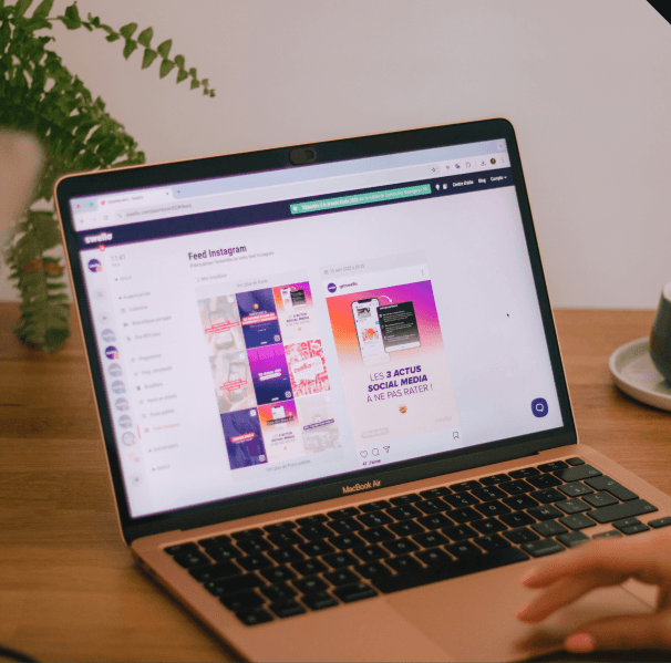
Design Tokens & Theme Architecture
Establish standardized foundational tokens for typography, color palettes, spacing, elevation, and responsiveness that ensure dynamic multi-theme scalability.
Unify your digital brand across every touchpoint. We build comprehensive, tokenized design systems and component libraries that empower your design and engineering teams to ship features faster with 100% visual consistency.
From foundation architecture to production-ready code integration, we eliminate UI debt and bridge the gap between design and development.
Establish standardized foundational tokens for typography, color palettes, spacing, elevation, and responsiveness that ensure dynamic multi-theme scalability.
Build robust, accessible component sets—from buttons and inputs to complex data tables—fully mirrored in Figma variables and production-ready code.
Define clear contribution workflows, version control systems, and update protocols so your design system scales seamlessly alongside your team.
Synchronize design components across Web (React, Vue, Web Components) and Native Mobile (iOS, Android) frameworks to maintain brand integrity everywhere.
Audit existing UI patterns to identify inconsistencies, consolidate redundant components, and refactor fragmented codebases into a single source of truth.
Inconsistent UI assets and repetitive frontend coding waste hundreds of hours every quarter. A centralized design system creates a shared language for product teams, eliminating re-work and accelerating time-to-market.
Simplified complex data visualization and streamlined user onboarding, boosting 30-day retention by 35%.
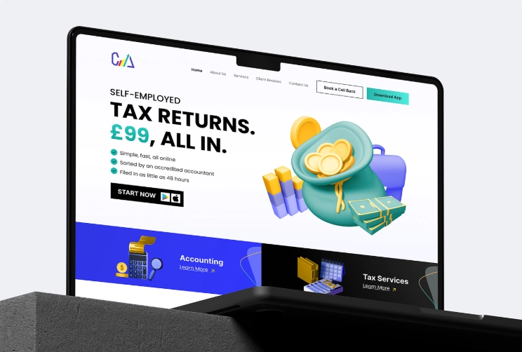
We transformed CAL Accountants from a traditional consultancy into a digital-first leader by delivering a comprehensive end-to-end ecosystem. This integrated solution featured a fresh brand identity, a conversion-driven website, and a powerful CRM coupled with a customer-facing mobile app that automates the entire tax submission and payment process.
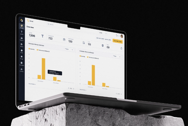
Amplify is a complete redesign of a construction project management platform, covering the website, web app, and mobile app. The project transformed an outdated, confusing system into a clean, modern, and intuitive SaaS experience by fixing broken user flows, redesigning all features, adding missing functionality.
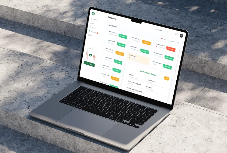
We transformed Talk Asia into a seamless SaaS communication platform by designing a custom web application from scratch. This integrated digital solution features an intuitive user interface, streamlined messaging workflows, and a conversion-focused design system crafted to scale team collaboration and enhance real-time engagement.
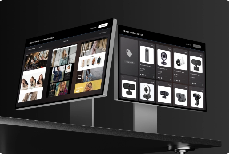
Designed and architected an advanced Marketplace Builder module that allows businesses to create and customize their own storefronts inside the PayEver SaaS ecosystem. The module includes a drag-and-drop page editor, layered page management system, customizable components, and full integration with the platform’s existing e-commerce inventory and business tools.
Our battle-tested creation process delivers scalable, adoption-ready systems tailored to your product stack.
Step 01
We catalogue every button, color, component, and code implementation across your current product ecosystem to spot patterns and visual drift.
Step 02
We establish core visual primitives—colors, type scales, grids, shadows, and tokens—that define your brand’s foundational language.
Step 03
We craft flexible, accessible, interactive UI components in Figma using modern variants, properties, and responsive auto-layout.
Step 04
We translate design components into production-ready code libraries and write comprehensive usage guidelines for designers and developers.
Step 05
We conduct team enablement workshops, set up versioning rules, and deploy live governance structures to guarantee long-term adoption.
Bridge the gap between design and development. We engineer synchronized design tokens and modular UI components that streamline product sprints, reduce technical debt, and ensure seamless developer implementation.
Key Deliverables: