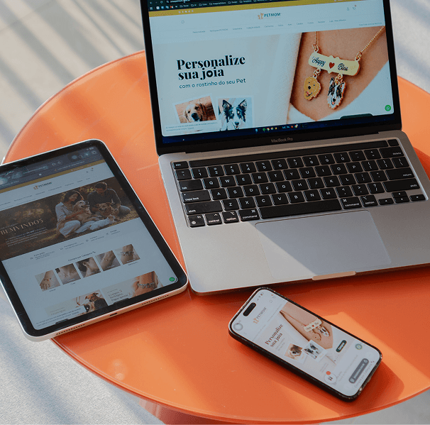
Responsive & Adaptive Layout Design
Craft fluid grid structures and adaptive layouts that deliver a tailored, pixel-perfect user experience across all screen dimensions.
Reach your audience on the screens they use most. We design priority-driven, lightning-fast mobile-first interfaces that scale effortlessly across smartphones, tablets, and desktop devices.
By prioritizing core features and user flows for smaller viewports first, we create clutter-free, intuitive mobile experiences that drive engagement and maximize conversions.
Craft fluid grid structures and adaptive layouts that deliver a tailored, pixel-perfect user experience across all screen dimensions.
Design ergonomically friendly interfaces with thumb-zone navigation, comfortable tap targets, and smooth visual touch feedback.
Optimize content hierarchy and visual assets to ensure rapid loading speeds and frictionless interaction on mobile networks.
Develop native-aligned UI components following Apple Human Interface Guidelines and Google Material Design standards.
Validate mobile prototypes across real hardware to ensure high readability, touch accuracy, and WCAG accessibility compliance.
Designing for mobile first forces product teams to focus strictly on what matters most to the user. By stripping away desktop bloat, you get faster load times, higher conversion rates, and better search rankings.
Simplified complex data visualization and streamlined user onboarding, boosting 30-day retention by 35%.
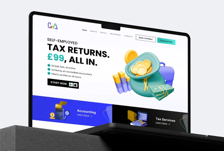
We transformed CAL Accountants from a traditional consultancy into a digital-first leader by delivering a comprehensive end-to-end ecosystem. This integrated solution featured a fresh brand identity, a conversion-driven website, and a powerful CRM coupled with a customer-facing mobile app that automates the entire tax submission and payment process.
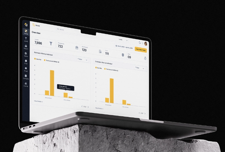
Amplify is a complete redesign of a construction project management platform, covering the website, web app, and mobile app. The project transformed an outdated, confusing system into a clean, modern, and intuitive SaaS experience by fixing broken user flows, redesigning all features, adding missing functionality.
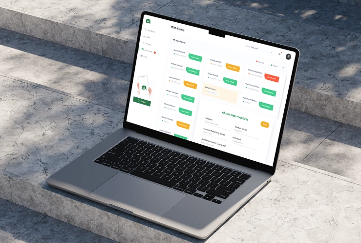
We transformed Talk Asia into a seamless SaaS communication platform by designing a custom web application from scratch. This integrated digital solution features an intuitive user interface, streamlined messaging workflows, and a conversion-focused design system crafted to scale team collaboration and enhance real-time engagement.
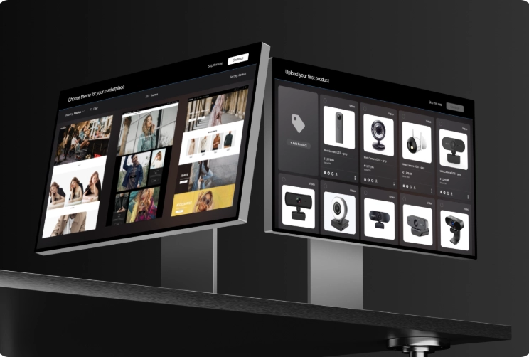
Designed and architected an advanced Marketplace Builder module that allows businesses to create and customize their own storefronts inside the PayEver SaaS ecosystem. The module includes a drag-and-drop page editor, layered page management system, customizable components, and full integration with the platform’s existing e-commerce inventory and business tools.
Our mobile-first methodology guarantees speed, accessibility, and intuitive navigation from initial concept to launch.
Step 01
We analyze your target audience's mobile habits, device usage, and contextual environments to inform interaction design.
Step 02
We identify essential user actions and structure mobile screen flows to eliminate unnecessary steps.
Step 03
We map out layouts optimized for thumb reach, gesture control, and quick task completion.
Step 04
We apply branding elements and refine typography, contrast, and spacing for small-screen readability before expanding to desktop viewports.
Step 05
We test design components across various screen sizes and hand off organized specifications to your development team.
Eliminate mobile friction. We prioritize essential content and intuitive touch patterns so your users can navigate, interact, and convert effortlessly on any device.
Key Deliverables: